888poker Unveils Green Brand Identity
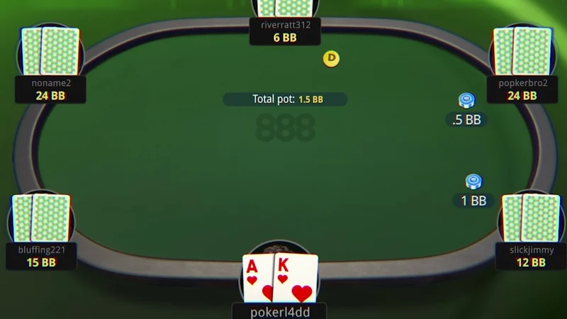
888poker has refreshed its visual identity with a new green-focused look, signaling a brand update for the online poker operator.
888poker Rolls Out a Green Brand Identity
888poker has introduced a refreshed brand identity built around the color green, marking a visual update for the long-running online poker operator. The change centers on the site's logo and overall presentation, shifting its look toward a green-dominant palette.
Rebrands of this kind are common in the online poker and gaming sector, where operators periodically update logos, color schemes, and interface styling to stay visually current and to differentiate themselves in a crowded market. A new identity typically rolls out across a company's website, client software, marketing materials, and promotional assets over time rather than appearing everywhere at once.
What a Rebrand Usually Involves
When an online poker room refreshes its identity, the work generally extends beyond a simple logo swap. Typical elements include:
- A revised logo and wordmark
- An updated color palette, in this case leaning on green
- Adjustments to typography and interface styling
- Refreshed marketing and promotional creative
- Consistency across web, desktop, and mobile platforms
The practical goal is recognition. A distinct, consistent look helps players identify the brand quickly across different channels, from the lobby to advertising.
Why Color Choices Matter
Color is one of the most immediate signals a brand uses. Green carries a range of associations in gaming and beyond, and operators often lean on it to convey a fresh, approachable, or table-inspired feel. For poker specifically, green also evokes the felt of a physical poker table, which can reinforce the connection between the online product and the traditional game.
That said, a color change alone does not alter how a poker room operates. Game formats, tournament schedules, software features, and player policies are separate from visual branding. Players evaluating a site should look at the product itself rather than reading too much into a new logo or palette.
What This Means for Players
For existing players, a rebrand is largely cosmetic. The practical experience, including how to log in, find games, and manage an account, generally stays the same, though the interface may look different as updates are applied. New visitors may simply encounter a different visual presentation than they might have seen previously.
Brand refreshes can also accompany broader marketing pushes, such as promotional campaigns timed to draw attention to the new look. Operators sometimes use these moments to highlight existing features or traffic-driving events, though the specifics vary by company and period.
The Broader Context
Online poker is a competitive space, and operators frequently adjust their branding to remain recognizable and relevant. Visual identity is one lever among many, alongside software quality, game selection, tournament offerings, and customer experience. A rebrand is best understood as a marketing and design decision rather than a change to the underlying product.
For observers of the industry, such updates are a reminder of how much of the competition happens at the level of presentation and brand perception. For players, the takeaway is straightforward: a new look is worth noting, but the fundamentals of the games and the platform are what ultimately matter.
888poker's move to a green-centered identity places it among operators that periodically revisit their visual branding. Whether the change meaningfully shifts player perception will depend on how consistently it is applied and what else the brand does alongside it.
FAQ
- 888poker introduced a refreshed visual identity centered on the color green, updating its branding and presentation.